Why Some Top Whiskeys Have Men’s Names and Square Bottles
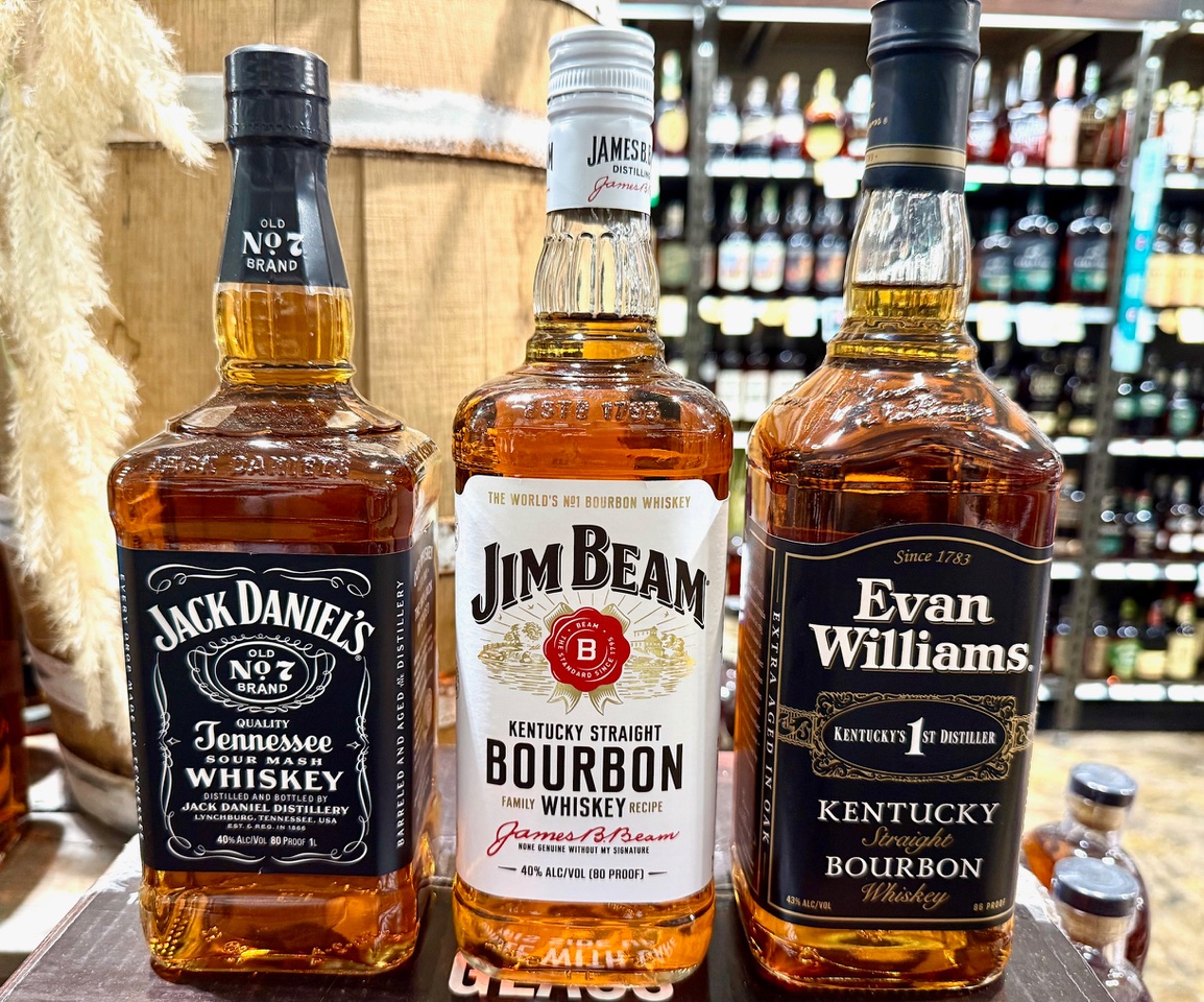
If you’ve spent any time browsing the whiskey aisle, you’ve probably noticed a trend among some of the best selling American whiskeys. Three powerhouses, Jack Daniel’s, Jim Beam, and Evan Williams, share a curious trifecta of characteristics: they are massive sellers, they are named after men, and they all come in rectangular or square bottles.
Is this a coincidence, or is there some copycatting at play? Let’s look into the history and packaging of these American staples.
The Big Three Sales
First, let’s establish their heavyweight status. While sales figures fluctuate and can be broken down in various ways, like by “whiskey” (which includes Tennessee Whiskey like Jack Daniel’s) versus strictly “bourbon” (like Jim Beam and Evan Williams), these three consistently rank as top sellers globally and in the American market. Jack Daniel’s and Jim Beam often swap places as the world’s highest-selling American whiskey brands, with Evan Williams solidly holding a top spot among bourbons as well. They are, simply put, giants.
The Man Behind the Name
Each brand proudly bears a man’s name on its label:
- Jack Daniel’s: Named for Jasper Newton “Jack” Daniel, the founder who registered his distillery in 1866.
- Jim Beam: Named for James B. Beam, the man who rebuilt the distillery after Prohibition and secured its modern legacy.
- Evan Williams: Named for the Welsh immigrant who, according to the brand, was Kentucky’s first commercial distiller, starting in 1783.
This isn’t surprising for American whiskey. Many, if not most, heritage whiskey brands are named after their founders, creating a link to an individual, a family, and a long tradition. It’s a common branding technique for a product rooted in deep history, so the men’s names are more a reflection of tradition than a coordinated effort.
The Square Bottle Question
This is where the copycat theory gets interesting. While the specific shape can vary slightly, all three use distinctly structured, square bottles.
Why a square bottle in the first place? The reason is less about aesthetics and more about logistics. Square or rectangular bottles are incredibly efficient for packing and shipping. Their flat sides fit snugly together in cases, leaving little wasted space, reducing movement, and minimizing the risk of breakage during transport, which cuts down on shipping costs. This design advantage was also historically useful during things like Prohibition, as some rectangular bottles, like those used by the Scotch brand Ballantine’s, were flat enough to be easily concealed.
So, who was first among our three?
- Jack Daniel’s gets the nod for popularizing the look. Jack Daniel’s, which began in earthenware jugs, is credited with introducing its iconic square bottle around 1897. The distillery’s reasoning, beyond logistics, was said to be a desire for a unique, honest, and distinct look that would stand out among the crowd of round bottles.
- Jim Beam also uses a distinctly square-shouldered bottle for its most popular “White Label” expression. Jim Beam’s history with bottle shapes is varied, including the famous bowling pin and other ceramic decanters in the mid-20th century, but its core product is presented in the structured, square format.
- Evan Williams is known for its tall, rectangular “Black Label” bottle. The brand, dating back to 1783 in name, is a modern product of Heaven Hill Distillery, which has used this sturdy, space-saving shape for decades.
Coincidence or Copycat?
The common ground of the square bottle and a man’s name, while strong, is more likely a combination of smart logistics and branding evolution rather than a simple case of one-upmanship.
- Logistics: The efficiency of the square bottle is an undeniable financial advantage for high volume producers, making it a natural choice for brands that ship millions of cases.
- Branding: Jack Daniel’s was indeed early with the distinctive square bottle in the late 1800s. The success of that recognizable shape, combined with the general logistical benefits, naturally influenced the industry over time. The structured, masculine lines of a square bottle also align well with the traditional, no-nonsense image of classic American whiskey.
The common elements are less a smoking gun of copycatting and more a convergence of practical design, a reflection of industry tradition, and a desire to project a consistent, recognizable image to millions of customers.

COMMENTS
Leave a Reply
Become an insider and receive weekly advice, tips, and insight on all things whiskey
.
Weekly tips, reviews and recommendations to help you enjoy whiskey life to the fullest.
JOIN THE LIST

Sippin' With Jordan Davis
sippin' with the stars

Million Dollar Cowboy Bar WY
old fashioned aF

5 Steps To Sip and Savor Whiskey
whiskey 101

Always very informative! Thanks for the education!